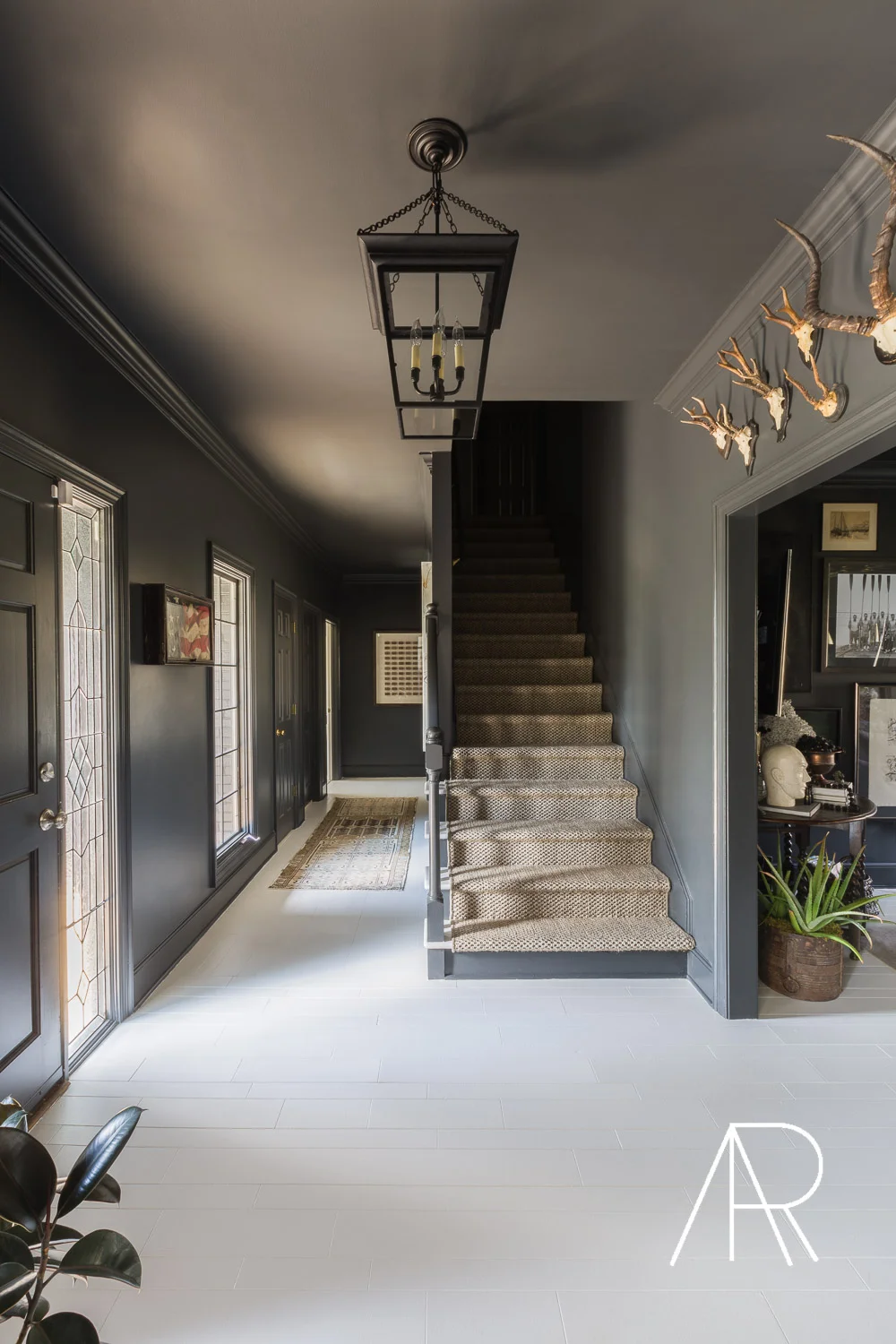
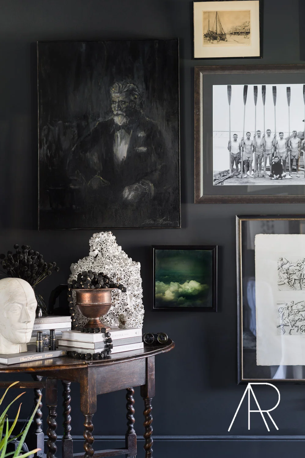
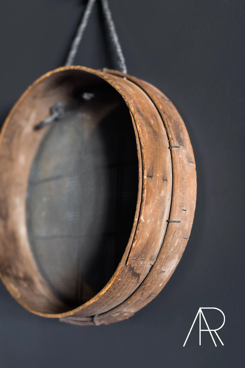
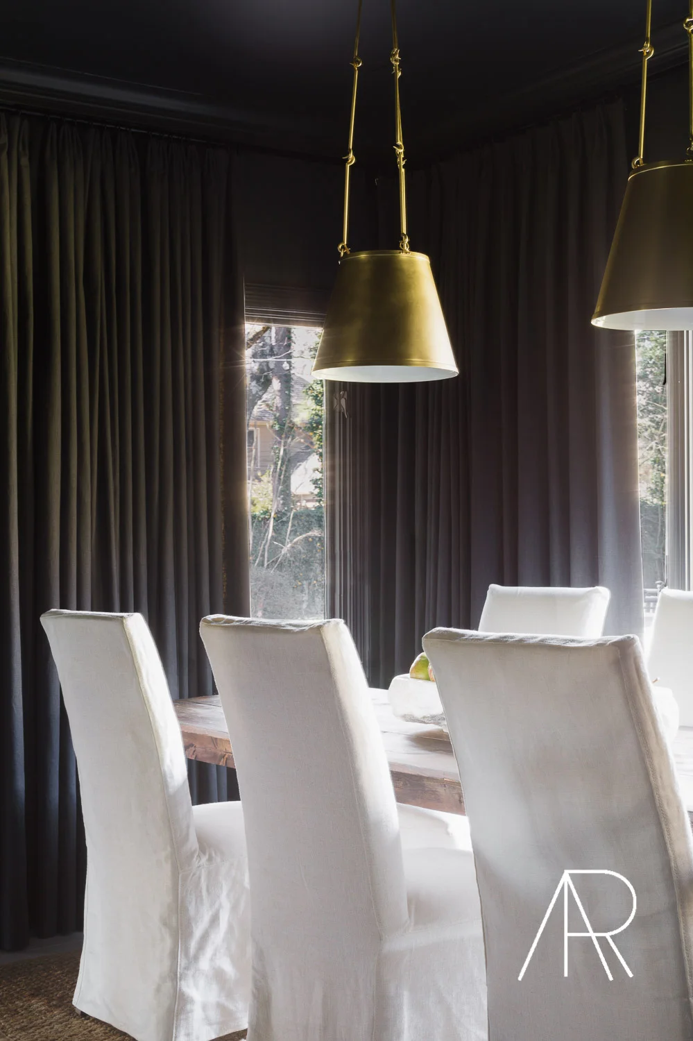
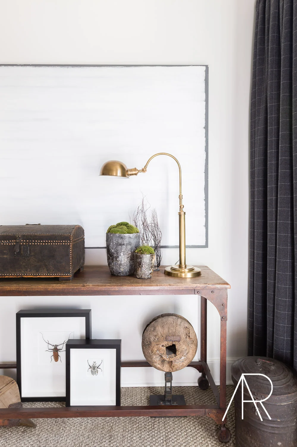
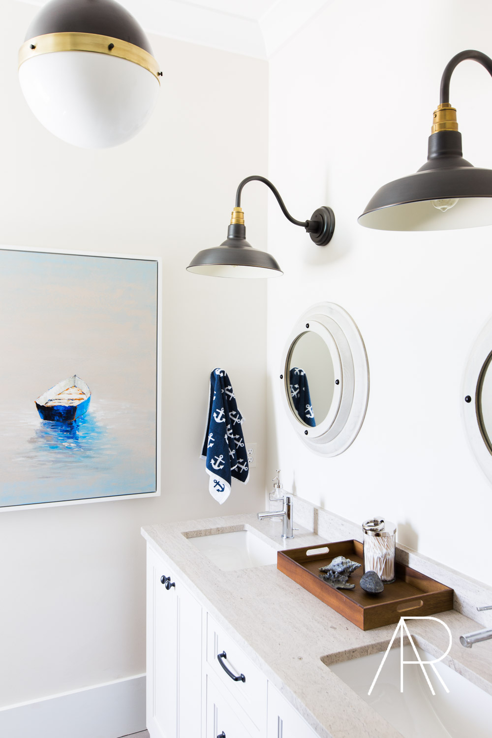
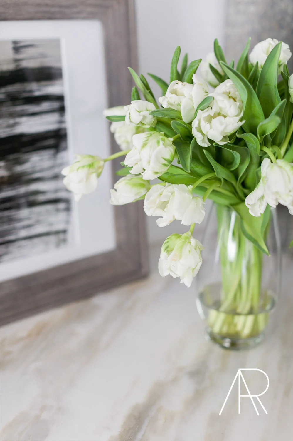
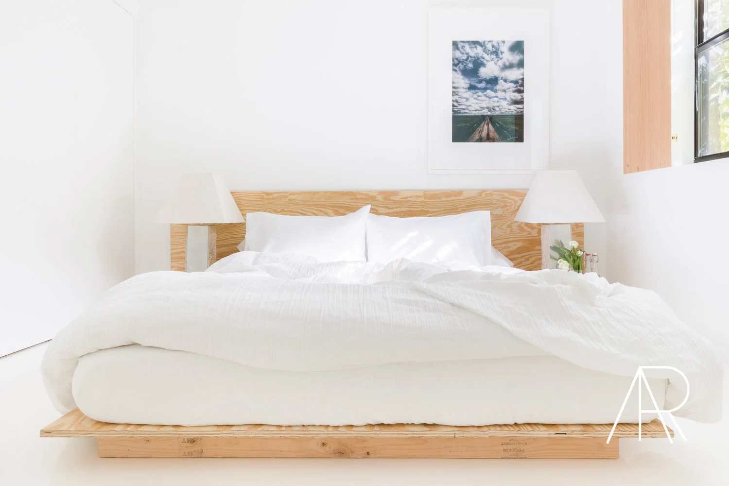
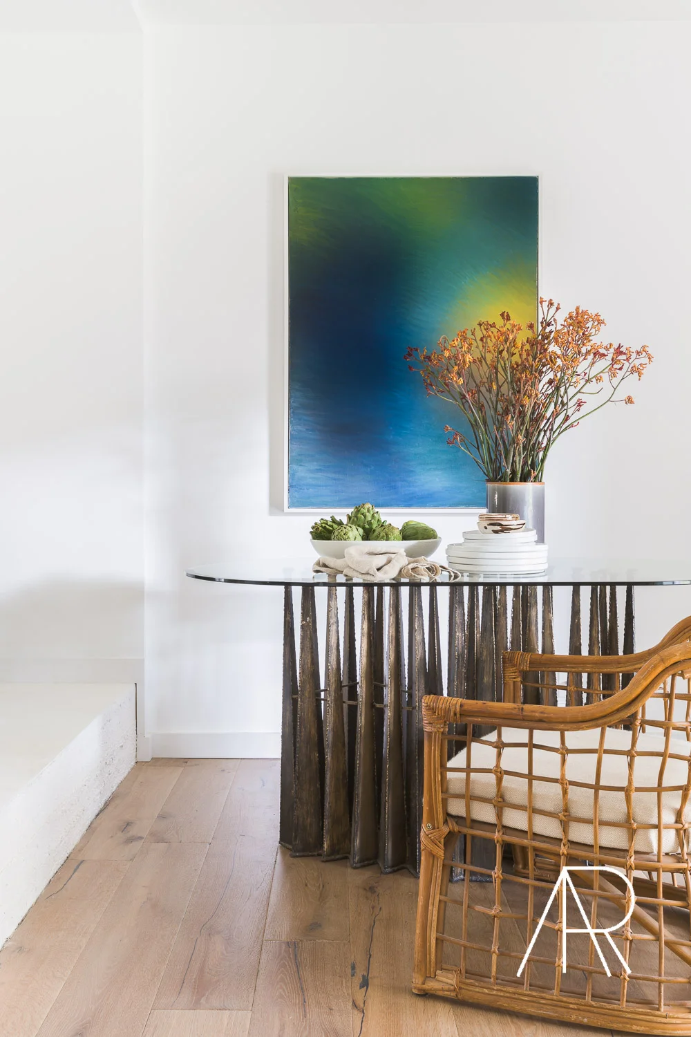
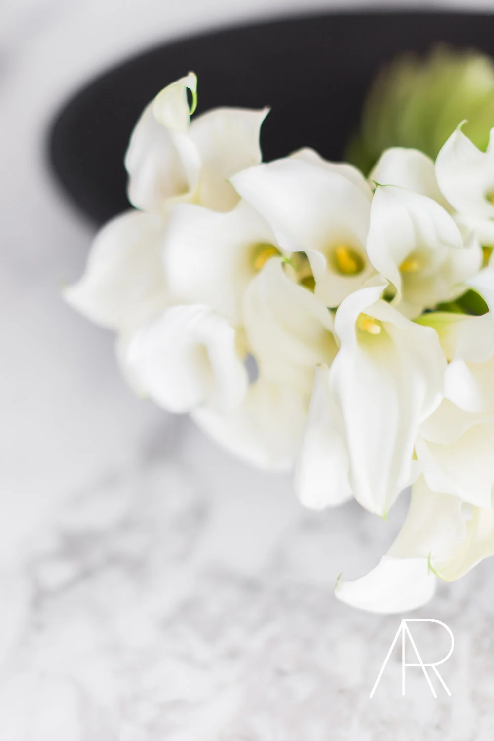
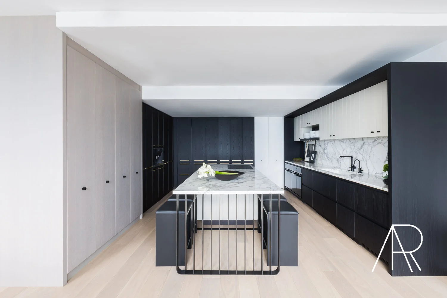
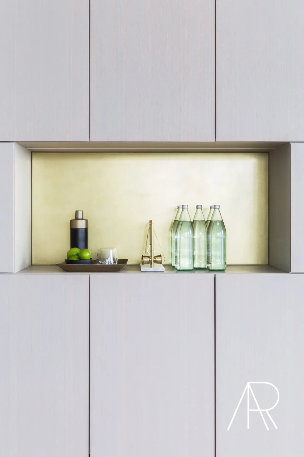
It’s always a treat to work with a dear friend, Memphis-based designer Sean Anderson. It’s even better when it’s his own home! Although you may not guess it from the photos, the family moved into the home as is. No renovations whatsoever! Sean decided to repaint the entire space—in matte black with white floors, no less—and plans to remodel the home in the coming years. It’s remarkable what a fresh coat of paint, a few green and white blooms, and an eye for design can do. Thank you to the incredible team at Elle Decor, it is always such a pleasure to work with this talented group!!!
Home Tour
Luke Bryan's Beachside Hideaway Featured in Traditional Home Magazine
I am excited to finally share this beach home shoot, featured in this month's Traditional Home! It came at the perfect time with Summer on my mind!! It's always such an honor when I travel and venture into the news stand to find my hardwork on the COVER of one of my favorite shelter magazines!! It truly feels like the work comes full circle and is out there in the world to add a little beauty and inspiration....... or to get all of our wheels turning for our next vacation destination!! The vacation home (which happens to be Luke Bryan's!!!) is in Florida, and was designed by Nashville-based designer Chad James. As a Nashville-based entrepreneur, I'm so fortunate to work with such amazing, creative, and talented go-getters—especially the occasional country music star!!!
To see more of this beach retreat, pick up the latest issue of Traditional Home or click here. Xx
A High-Style Bachelor Pad in Austin, Tx with Architectural Digest
I’m excited to share designer James Saavedra’s home in Austin, TX with you. This 750-square-foot condominium is the ultimate example of small space chic!! He’s filled the space with the most amazing art and vintage finds, namely the living room coffee table which is a beautiful piece from John Saladino . The finished product was the fruit of a collaborative styling effort. I incorporated layered elements throughout the home to add dimesion and one of my favorite ways to add depth were the beautiful frames along the kitchen counter to give the space a little structure. The immensely creative James, who’s also an artist, created the black and white drawings in those frames upon my request—the night before the shoot. Improvising: it’s one of the secrets to nailing the perfect shot!!!
For a full look at James’s home, visit ArchitecturalDigest.com. Xx
A Sundrenched, Contemporary Apartment Remodel in Chicago for AD
It’s not always easy to make a contemporary interior feel lived-in. Often, such spaces feel stark, neutral, and sterile. However, at a recent shoot of Alexis Bednyak’s stunning (and contemporary!) design for Architectural Digest, I found it quite simple to create a warm and inviting look. I mean, with this natural light, who wouldn’t want to spend time here?! To see some fun before and afters of the space, head to the link below. Xx
To see my shoot of this striking Chicago apartment, visit ArchitecturalDigest.com. Xx
