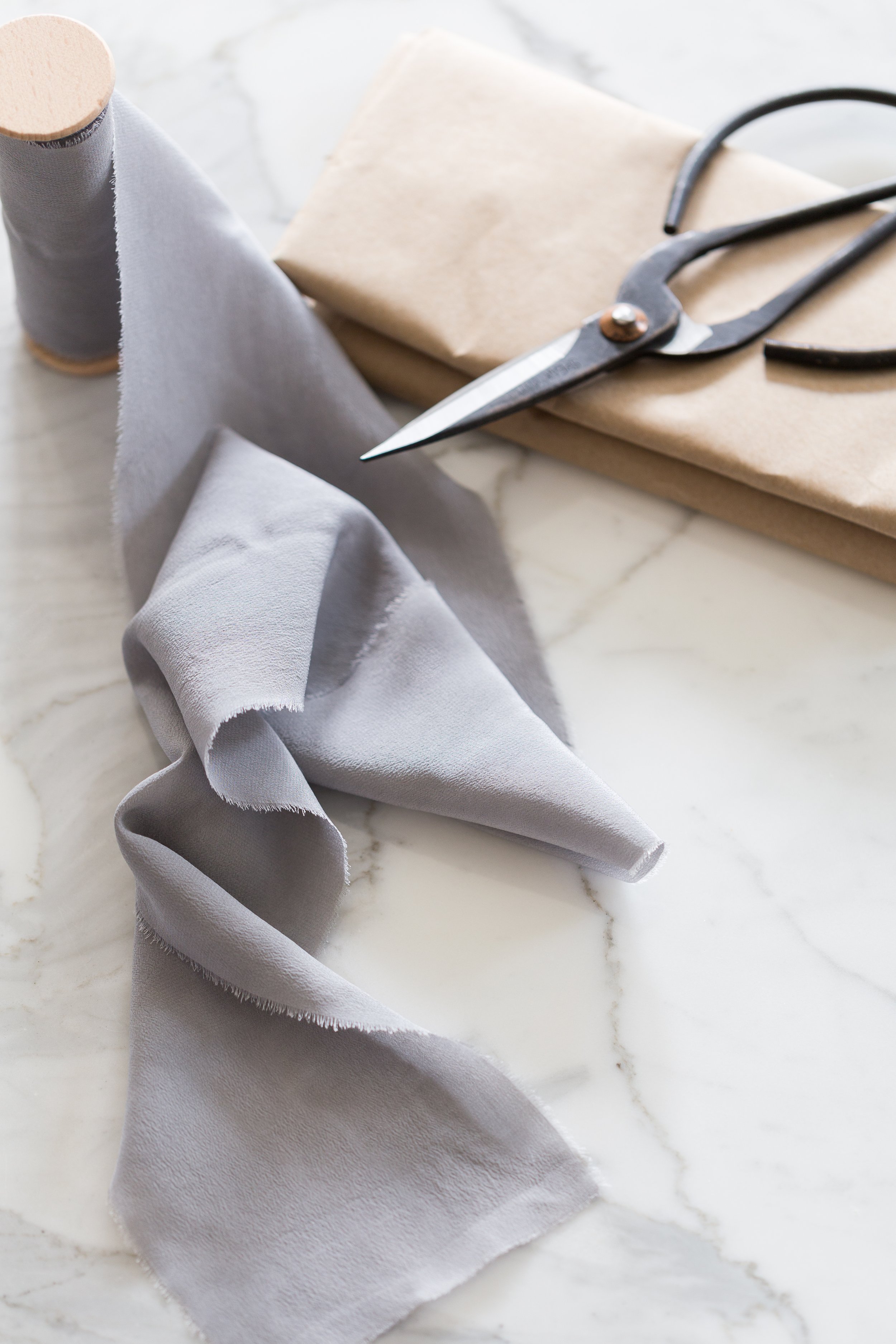
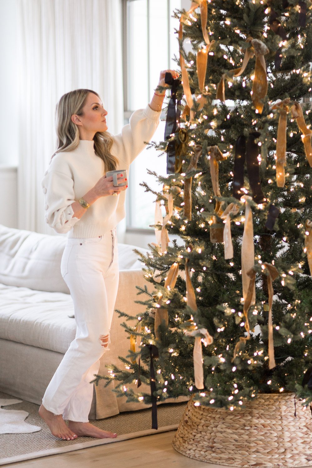
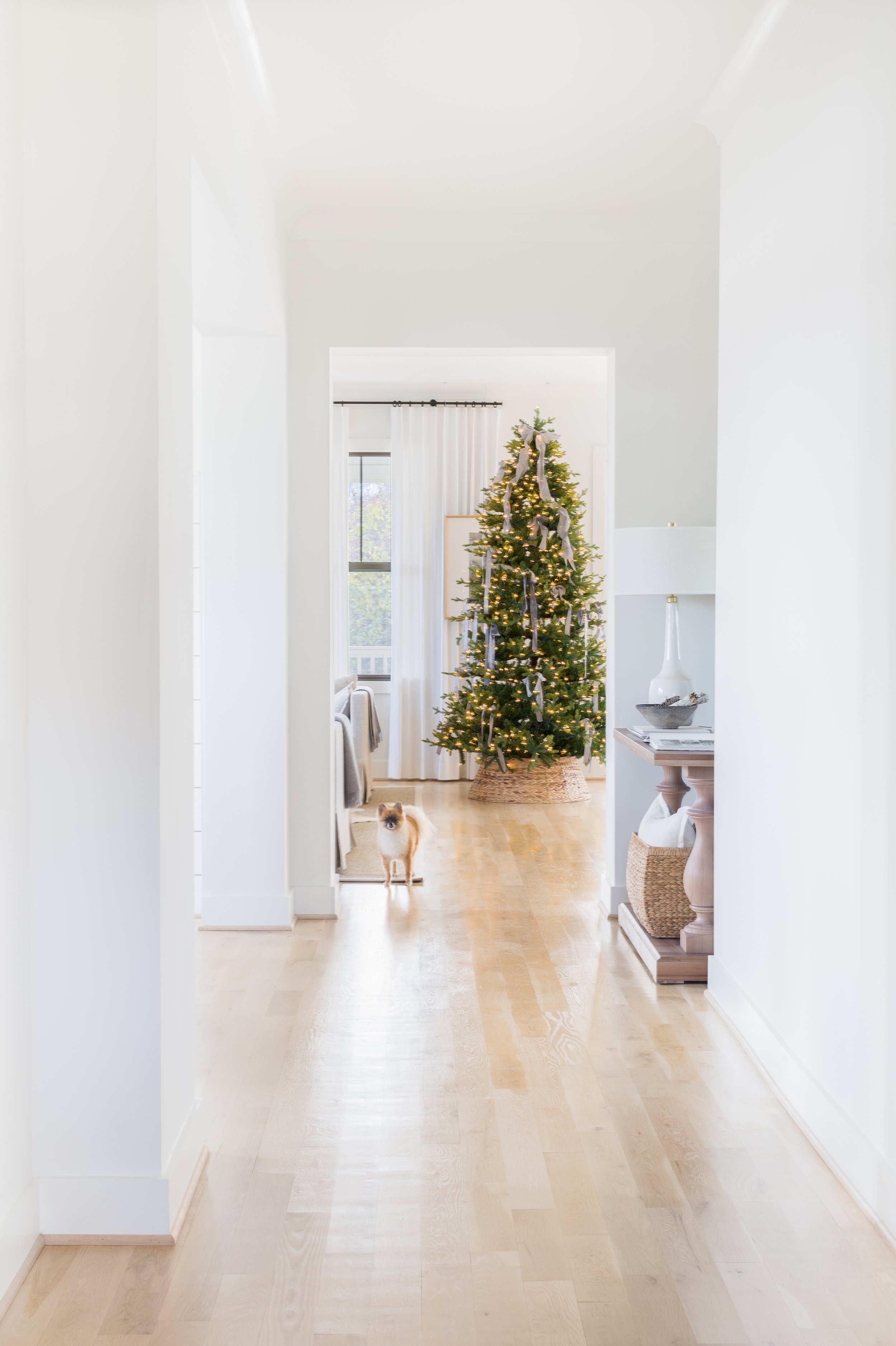
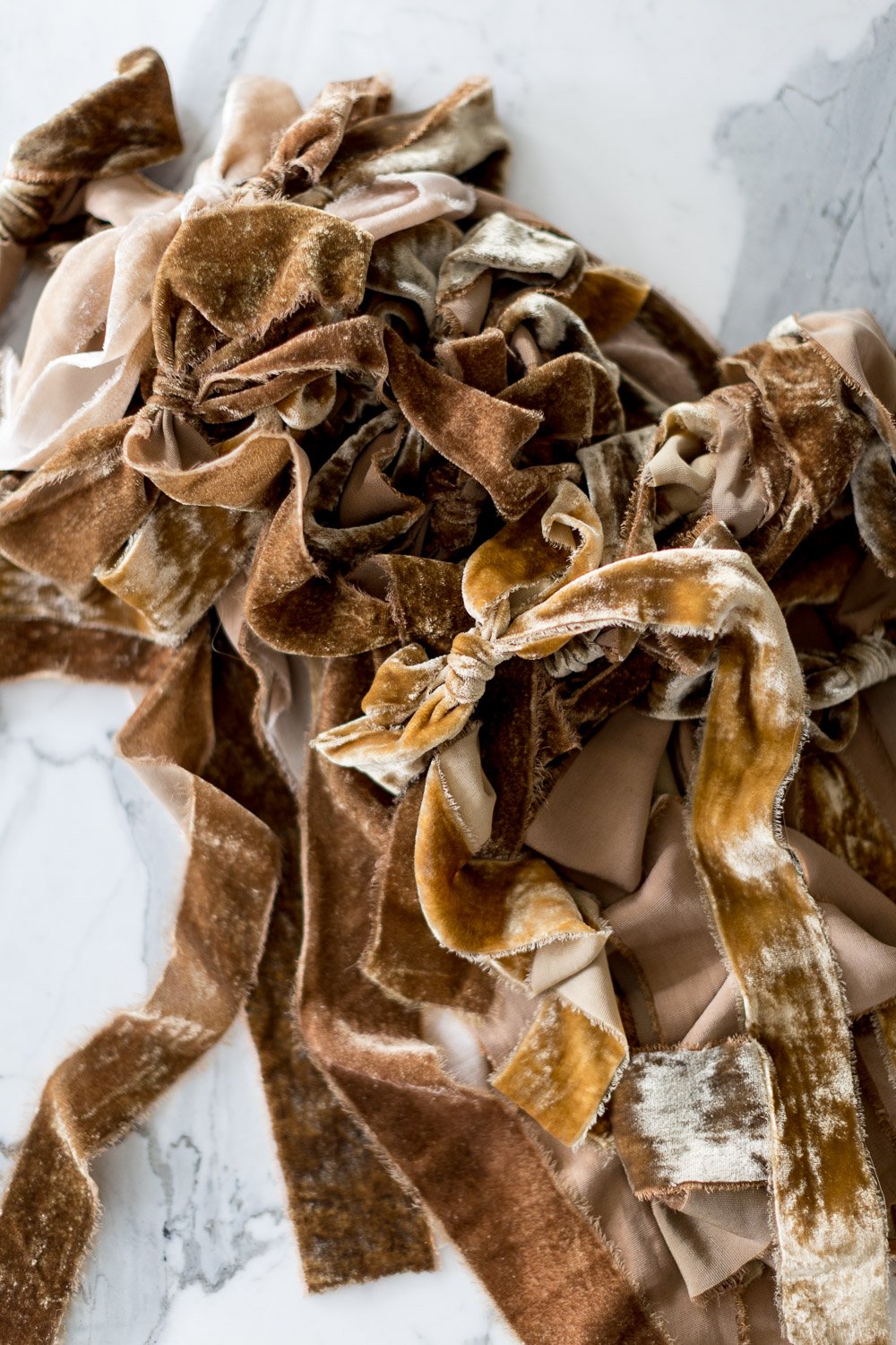
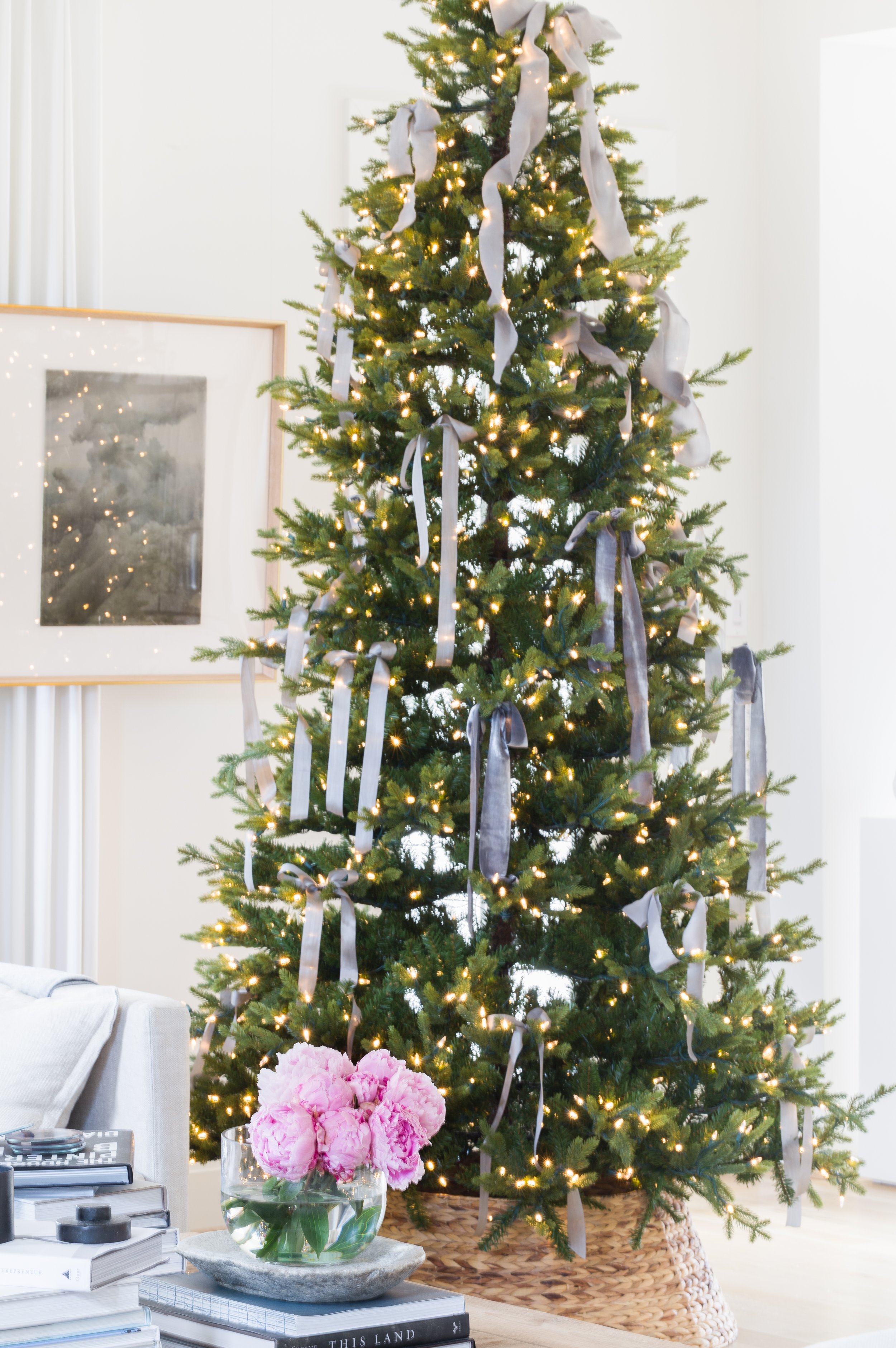
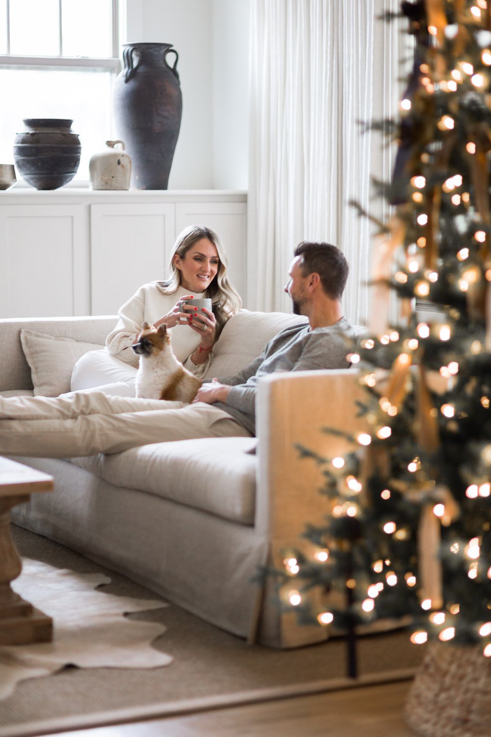
I recently shared my secret weapon for an easy, elegant Christmas tree with Elle Decor: RIBBON. And while the beauty of a well-styled tree is undeniable, I am thrilled to share my Christmas tree styling tip for a few reasons. First, my tree represents love. Growing up Jewish, we never had a tree. This was the first time we brought a tree into our home, and to me it represents the warmth surrounding the season. Second, I love using ribbon because it is an easy, affordable way to elevate a tree without having years of ornament-collecting under my belt. I used vintage velvet ribbon for mine, which instantly adds a layer of softness to the space. To see my tip and 50-plus more ideas to make your season extra special, read the story here.
Homeowner
The Washington Post | Alyssa Rosenheck's Tips for Photographing Your Home
The Home: it’s our safe haven from the world, a place to dream, to grow , to love, to rest and certainly, create. My camera gives me admission into homes all over the country. I sense the homes filled with love, filled with time honored stories and a soulful patina. But most of all, I feel honor and gratitude to document the sacred spaces of others. I enjoyed sharing my tips with the Washington Post for Photographing your home. Whether you want to simply capture a space that is both the source and a byproduct of your inspiration OR you have more concrete goals in mind–listing your home, sharing your design work, finding a tenant–you have a foundation for success here. Below are my favorites tips and to read my full conversation; head over to the The Washington Post.
ONE | Level Up - It is a quick rookie mistake when one thinks hand holding the camera is going to yield super star results. Invest in a simple tripod for your dslr or an attachment for your camera phone. Straight lines are the oxygen to an image, when capturing straight horizontal and vertical lines, the image, the composition, the components within the image will breathe and sing a chorus line to the viewer but when the lines are off, your eye immediately catches this and the crooked lines become a focal point and misses the mark. Hence, the need to level up and have a tripod.
TWO | Lens - First, set an intention through your own personal and emotional lens. Each room has an energy and story to tell. The four walls of our home and creative spaces are where we love, find inspiration and grow (hello #TheNewSouthern) and what a cool privilege it is to be the one holding the camera while communicating a story of these spaces that have supported you and many more to come. Second, invest in a good prime lens and wide angle lens. One of my favorite prime angle lenses is a 50 mm because this lens is most representative of what your natural eye sees. My goal as a photographer is to communicate a space inspiring stillness while also transporting you to what I am experiencing as I am in the space. Prime means having a fixed focal length, and shooting with a fixed lens also motivates you to move around the space and really focus on achieving the perfect frame for the shot. Wide angle lenses are important in capturing the scale of a space. I encourage you to rent as many as you would like and play around with what feels most natural to you without distorting the image. If you are using a phone, there are really affordable wide angle lens accessories as well if you are on the go.
THREE | Let there be light - Natural light. I find it necessary for an image to be the most accurate representation of a room as possible.. It is camera vs. eye, and all cameras are not created equal when it comes to the vast dynamic range of our eye. I am known for bright and crisp images so it always surprises my clients and observers when we are starting to photograph the house and I am methodically flipping off all the light switches. Is it counter intuitive? Yes. But it yields the most natural look of the color of the room and all the beautiful things within it. Natural light also forces you to adapt to what you are given while understanding all exposure options. The only way to know what works for you is to practice during different times of the day while studying the way light moves from room to room. For me, this is a form or prayer and poetry.
FOUR | Be a Straight Shooter - I am a back to basics kind of gal in every area of my life especially when it comes to angles behind the lens. Let’s keep things simple and shoot straight on. This will yield beautiful clean lines and communicate the simple geometry of the space. Over complicated angles and postions result in fussy images and confused focal points.
Photo + Styling: ©Alyssa Rosenheck for Luxe Magazine Design: Amanda Barnes Interiors
FIVE | Layer - an image is technically flat but what makes it come to life with great dimension are its layers. The rooms you are shooting need to communicate a stillness or an emotion to the viewer. There needs to be an element of visual texture to the space for it to have dimension. Ways to do this are decorative tabletop accessories, layered sculptures/artwork leaning against a wall, layered rugs to draw the eye in, incorporating texture through throws and fabric selections, and fresh flowers picked from the garden. Leave the red roses at the store and stay within a neutral color palette such as whites, greens, and blushes. This color palette will keep an image fresh and attainable without it being season specific.
Photo + Styling: ©Alyssa Rosenheck for Mydomaine and Design: Allison Crawford
SIX | Composition - I find composition to be much more important than the camera you have in your hand. It enables the space’s story to be told through object arrangement and placement. I can communicate a particular point of interest through my focal point or can introduce a moment of relief by emphasizing negative space. There are numerous theories behind composition, but at a very basic level, your goal should always be to achieve straight lines, balanced layers and let the rule of 3rds guide your lens.
©Alyssa Rosenheck for Architectural Digest - Design: Alexis Bednyak + Searl Lamaster Howe
5 Tips to Stage Your Home Before Putting It on the Market with Alyssa Rosenheck for Zhush
Traveling across the country to shoot and style homes for leading designers, architects, and celebrities pushes me to go deeper than the walls and capture the light and life giving moments each space embodies. In the process, I’ve come to realize that styling and shooting a home for editorial is not so different from prepping a home before it hits the market. With hundreds of miles in experience under my belt, I’ve put together my Top Five Tips for Staging a Home for one of my favorite blogs and Interior’s Enthusiast, Zhush!!
Much like readers, new homebuyers want to be captivated by a space. To do this, I focus on establishing a feeling of stillness and pause so that each viewer is able to slow down and connect. Our homes are where some of our most precious work begins. Within these four walls we build our dreams, harness our passions, hone our creativity, and take the time we need to rest.
My go-to tips make it easy for another family to step in and imagine themselves writing their own, unique story within the space. Selling a home means closing a chapter but for another family, you are helping to lay the foundation for their next. When it comes time for your home to hit the market—let’s make sure it’s a space that redefines traditional methods of staging to feel welcoming, warm, and full of love and gratitude!


